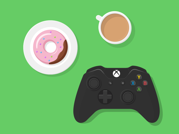
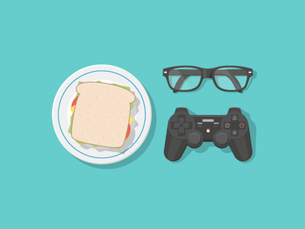
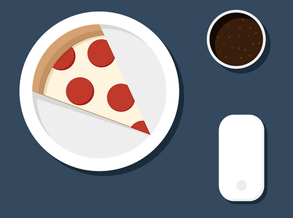
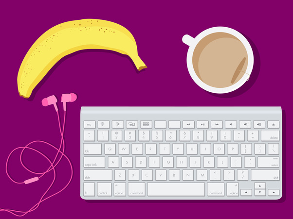
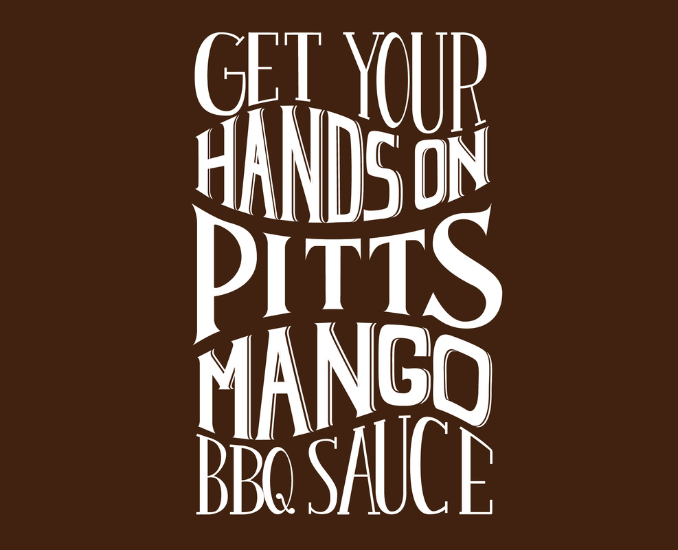
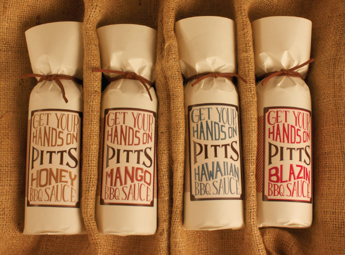
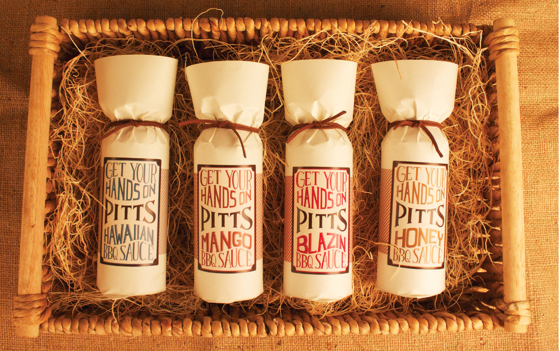
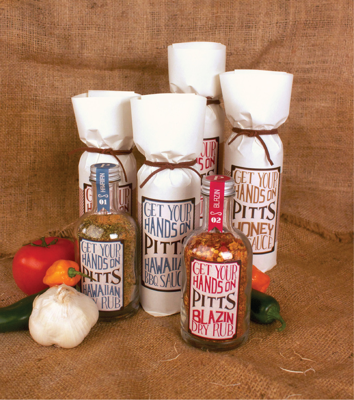
So my boyfriend Sean, who is also a designer, sent me a link for a new little project he did. He found this first image on Dribbble.com, called "Gamer Survival Kit", which was actually a response to the second image, "Ready to Play". The third image is Sean's response, so I decided to play along, and make my own version of "Desk Essentials", which you see at the very bottom. :)
0 Comments
Yay! Weather Underground finally updated their logo, and revamped their mobile app and website. I definitely think this is a good update for them. Looking much cleaner, more intriguing and more fun! It looks like they took some inspiration from some of Google's product logos. Reminiscent of Google Wallet, Google Play, Google Drive. Overall, I think it makes this brand much more current, so good job WU!
I recently saw this packaging at Clark's when I was doing some grocery shopping, and I loved it! Its so simple, yet very cute! Not only is the packaging cute, but also very environmentally healthy with a clay and chlorine free box, and a unique popping bag that is grease resistant, and compostable. So, head to Clarks and get a tasty snack you can feel good about eating!
I found this project that a company did for Abode and "Remixing" their logo on Behance recently, and thought it was so cool and super creative. You can read more about this project here: http://www.behance.net/gallery/The-Made-Shop-Adobe-Logo-Remix/12759259
Recently, I was shopping for some supplies, and noticed that Degree's deodorants had a bit of a facelift! New logo, and packaging for some of their products. Check out the new look below!
After the City of Toronto heard that its residents weren't too happy with their current logo, they asked 8 designers to make ideas for a new Toronto logo for their review. Below are the contenders. For more info: http://www.theglobeandmail.com/news/toronto/reimagining-the-way-we-think-about-toronto/article16284100/ I found this on Pinterest, and if you are a designer- not only will you understand this, but you'll find it hilarious. It is the best client comments turned into posters. Enjoy!
It looks like these companies were inspired to make changes in the new year! Black and Decker, Absolut Vodka, Visa, Aleris, and Cadillac all opted for new logos in the past month. I can definitely see an overall shift to clean and modern lines. I think for the most part, the new logos are a hit. Black and Decker is probably my favorite new redesign. Absolut on the simplification bandwagon as they stripped their old logo and went modern. Visa didn't stray too far from their old look, but simplified the colors and lines. If you aren't familiar with Aleris, it is a healthcare company that went for a whole new look, and I am liking it! However, I am not a fan of the new Cadillac logo. To me it loooks like they took off the wreath, and stretched the old logo. For more info:
Black and Decker: http://www.wired.com/design/2014/01/black-decker-logo-redesign/ Absolut: http://designtaxi.com/news/363199/Absolut-Vodka-Unveils-New-Minimalist-Logo/ Visa: http://www.underconsideration.com/brandnew/archives/new_logo_and_brand_positioning_for_visa.php#.Ut67IaWttFQ Aleris: http://www.underconsideration.com/brandnew/archives/new_logo_and_identity_for_aleris_by_bold.php#.Ut7AkaWttFQ Cadillac: http://adage.com/article/news/cadillac-unveils-logo-iconic-wreath/291190/ |
WELCOME!
Thanks for visiting my blog! Enjoy! Archives
March 2016
Categories
All
|