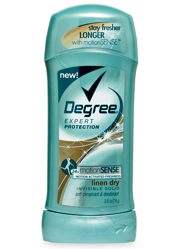
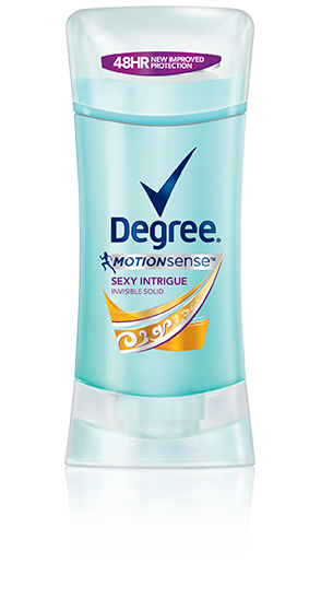
This is another one of my favorite marketing campaigns that I have seen recently. I like the differentiation and creativity used within each commercial. It's definitely versatile, and could appeal to many audiences, which is why I think these ads are effective.
I saw this commercial while watching TV and I thought it was a really effective use of marketing. Other countries take stronger efforts to discourage smoking cigarettes than we do in the U.S., so I was impressed when I saw this ad. Take a look... As cliche as you might think this is- being that I am a girl (who happens to looooove puppies), my favorite Super Bowl commercial was definitely Budweiser's puppy and horse ad. It was adorable, and definitely got the attention, and the 'aw's of everyone at the party. If you didn't get to watch it, here it is: So, since that was basically a given for my favorite, I'll give a few more of the ads that I liked from Sunday's game. I love what Doritos is doing with their new ads, by asking customers to make ads. They had some funny ones, but I posted my favorite below. My last pick was the Volkwagon "wings" ad. See the videos below. Recently, I was shopping for some supplies, and noticed that Degree's deodorants had a bit of a facelift! New logo, and packaging for some of their products. Check out the new look below!
Aerie, the underwear/lingerie brand of American Eagle Outfitters takes a bold step into the advertising world, as they have decided to stop using supermodels in their advertisements, and are not retouching any of the women in their photos. The ads support women's real beauty and read that, "The real you is sexy!" I personally think this is an impressive statement to be made by Aerie. With the media's focus always on looks and weight, girls think its expected for them to look like the models do. I think campaigns like these, or the Dove Real Beauty campaign are good for self esteem of women. Check out the ads from the campaign below. For more information, go to http://www.huffingtonpost.com/2014/01/17/aerie-unretouched-ads-photos_n_4618139.html#slide=1194119. It looks like these companies were inspired to make changes in the new year! Black and Decker, Absolut Vodka, Visa, Aleris, and Cadillac all opted for new logos in the past month. I can definitely see an overall shift to clean and modern lines. I think for the most part, the new logos are a hit. Black and Decker is probably my favorite new redesign. Absolut on the simplification bandwagon as they stripped their old logo and went modern. Visa didn't stray too far from their old look, but simplified the colors and lines. If you aren't familiar with Aleris, it is a healthcare company that went for a whole new look, and I am liking it! However, I am not a fan of the new Cadillac logo. To me it loooks like they took off the wreath, and stretched the old logo. For more info:
Black and Decker: http://www.wired.com/design/2014/01/black-decker-logo-redesign/ Absolut: http://designtaxi.com/news/363199/Absolut-Vodka-Unveils-New-Minimalist-Logo/ Visa: http://www.underconsideration.com/brandnew/archives/new_logo_and_brand_positioning_for_visa.php#.Ut67IaWttFQ Aleris: http://www.underconsideration.com/brandnew/archives/new_logo_and_identity_for_aleris_by_bold.php#.Ut7AkaWttFQ Cadillac: http://adage.com/article/news/cadillac-unveils-logo-iconic-wreath/291190/ |
WELCOME!
Thanks for visiting my blog! Enjoy! Archives
March 2016
Categories
All
|